Lyft Brand
Don’t call it a rebrand.
It’s a refresh.
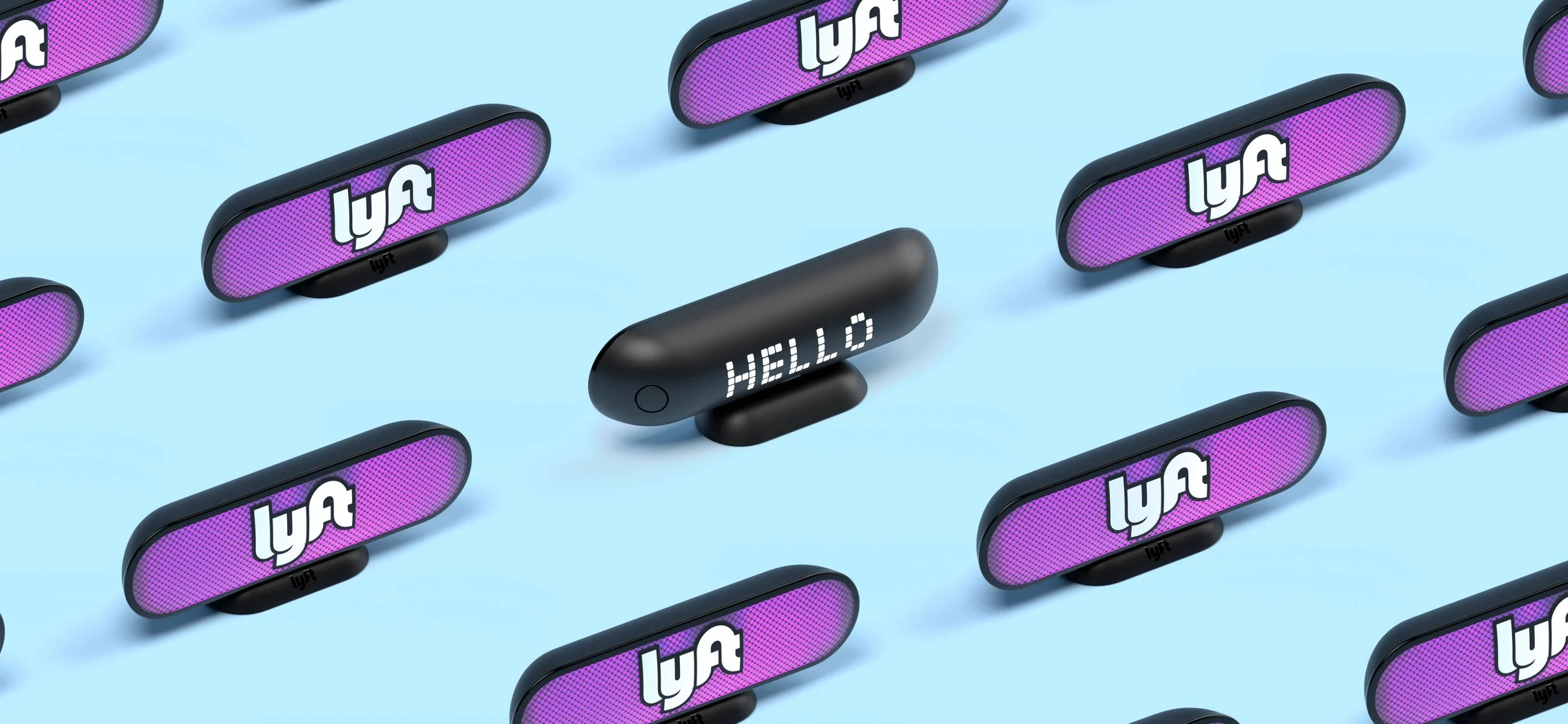
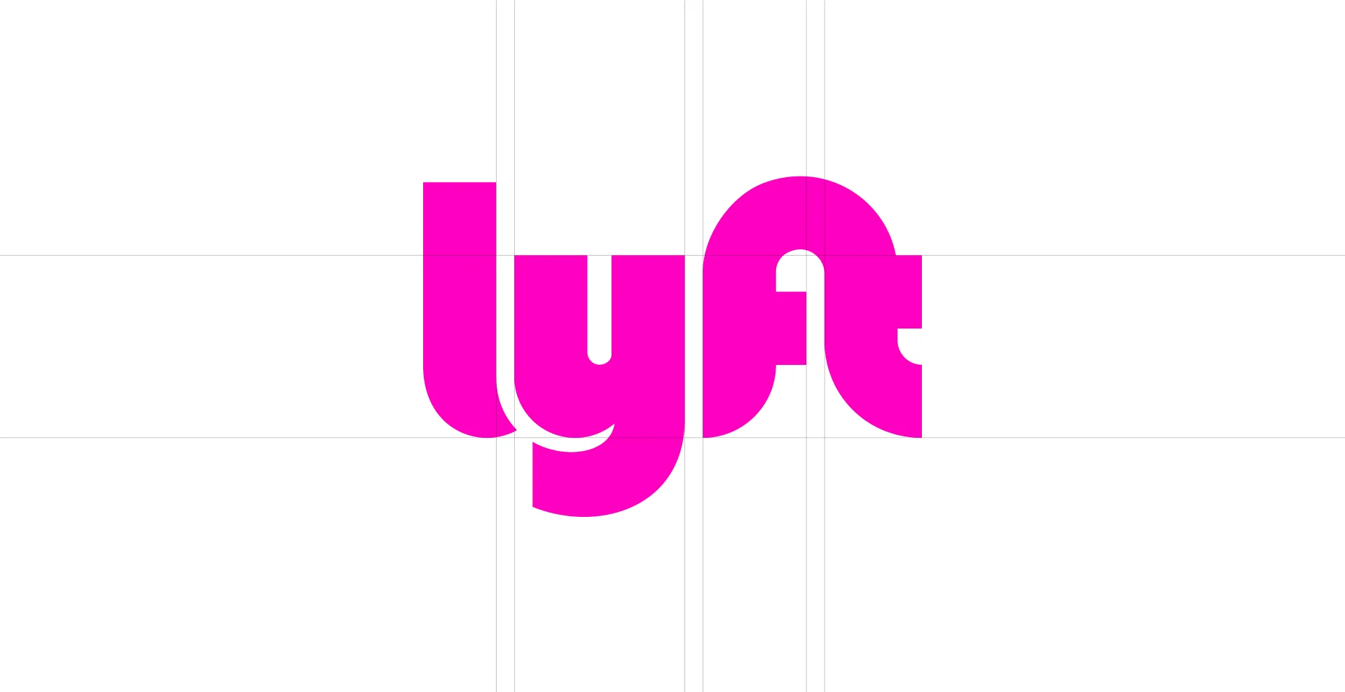
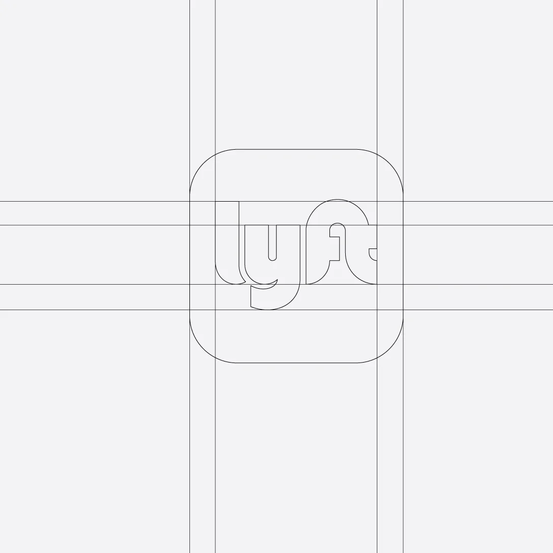
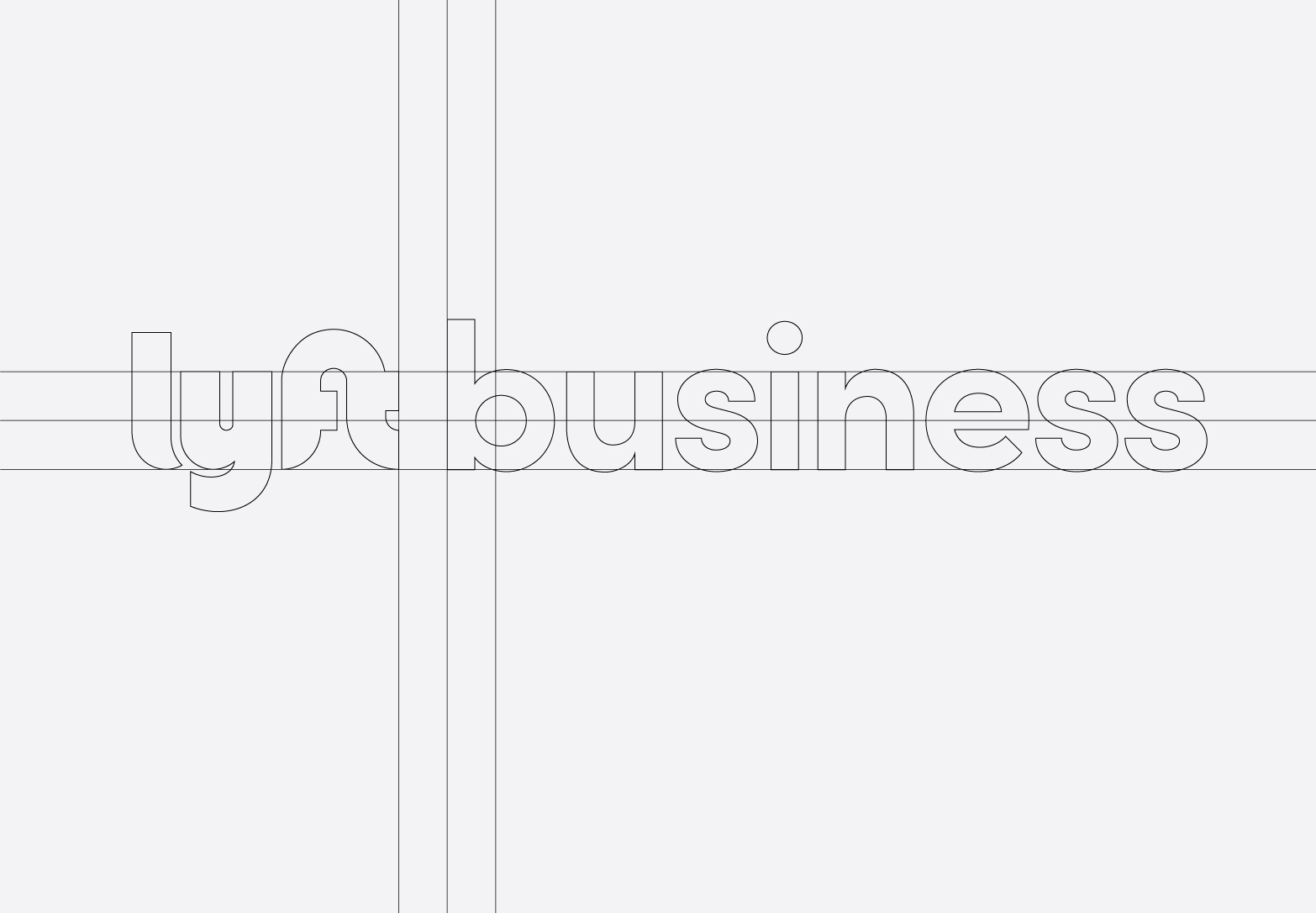
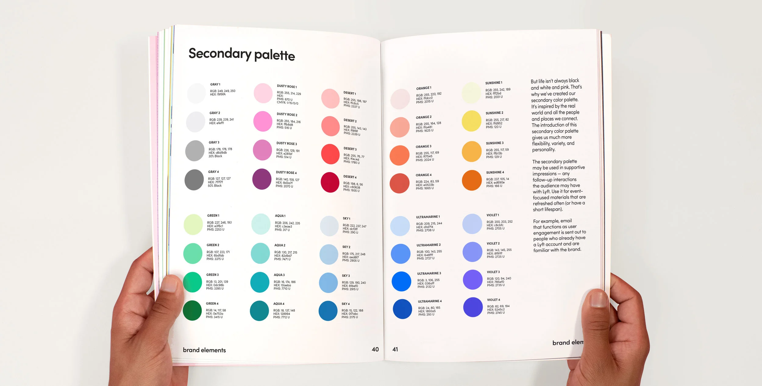
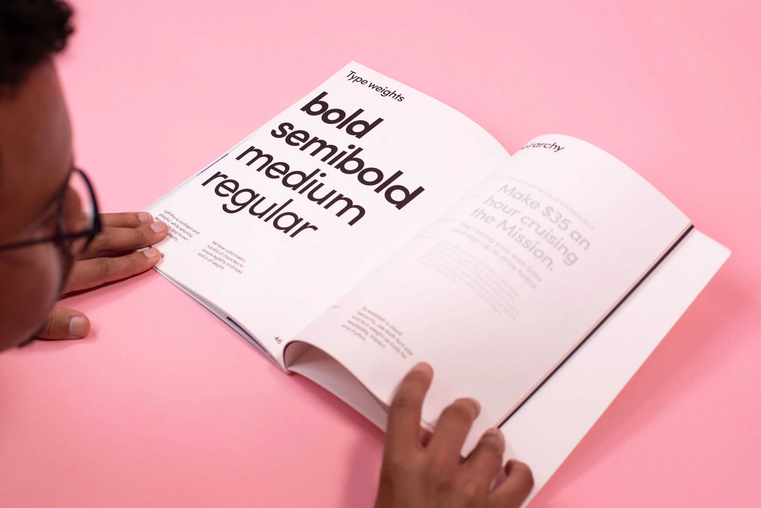
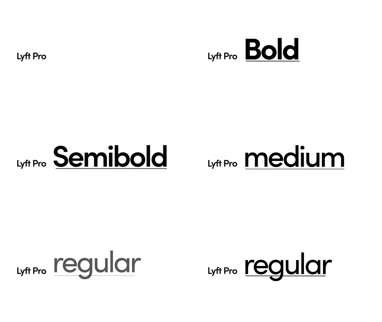
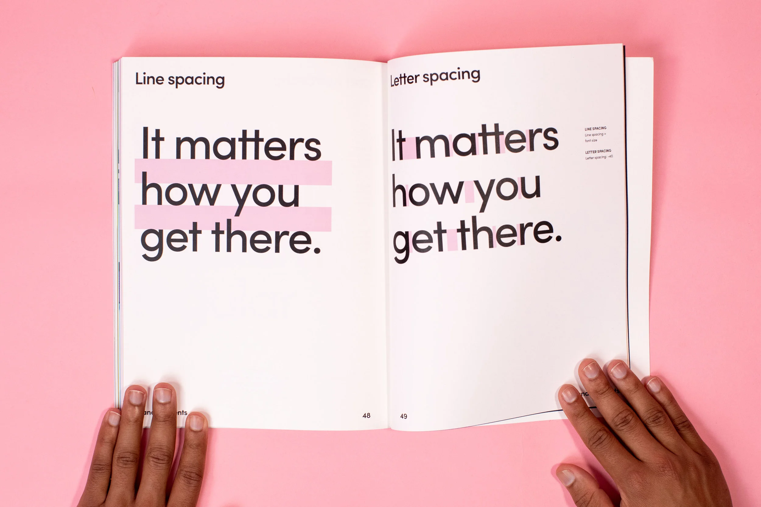
While it’s mostly rooted in familiar elements, we created a design system to give Lyft the tools it needs to properly express itself. We pixel-perfected the logo as well as introduced a rich secondary color palette (because the whole world isn’t black, white and pink). We created a new font with as much personality as the brand itself and built a new library of icons.
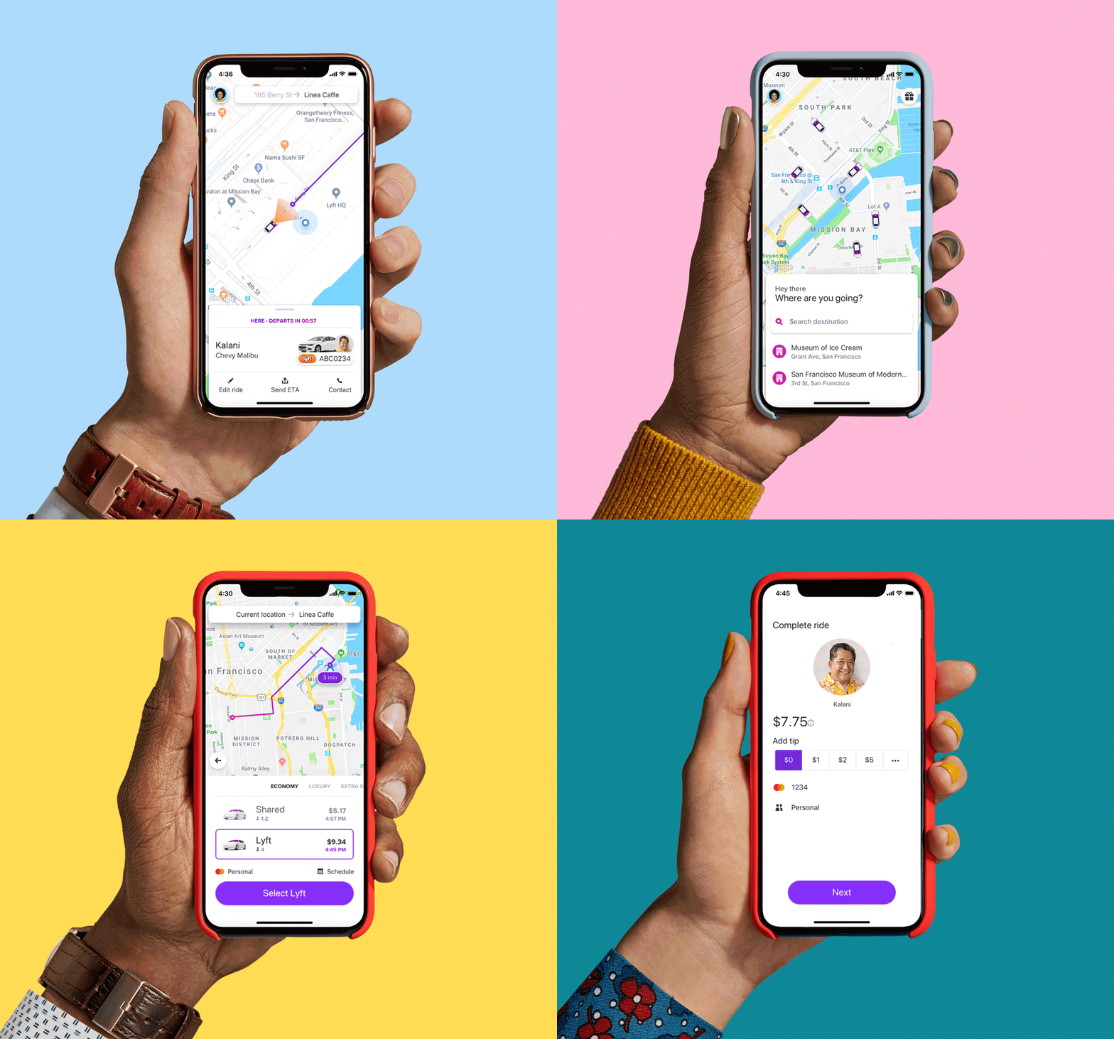
This system carries through all things Lyft, from a whole new website experience, to an updated app interface, to IRL experiences, down to every damn email that goes out. The whole idea was to create a foundation, not a box, to allow the creative juices to flow.
Design Principles
01 Be Simple
Simplicity is the whole reason Lyft exists in the first place. Designs should be easy to understand and free of unnecessary clutter. Busy is bad.
02 Be Bold
This clash of opposing forces will be a gauge for anything from materials and finishes to physical experiences and beyond
03 Be Expressive
We should always strive to maintain that unique Lyft spirit, and never be stodgy, arrogant, or mean.
Colors
We are as colorful as our diverse and eccentric community of riders and drivers.
Our primary palette is the core of our brand identity and our history, from the early days of furry pink mustaches. However, at the core of this brand refresh is the introduction of a revamped secondary color palette, a necessity to give more flexibility and personality in the designs Lyft creates. The palette is pulled from the real world, from the people and places we connect .
Oh, and it’s accessible, of course.
Icons
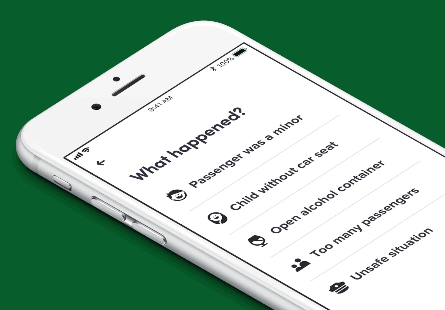
We created a completely new set of icons that are bold and confident. Inspired by the great iconography in wayfinding and transportation design throughout history, these icons were created to work nicely with Lyft Pro and carry the friendliness that is inherent in the Lyft brand.
Thanks fam.
